
December 8, 2013

Bulldog Drummond
Bulldog Design: Santa Barbara’s Swell Athletic Club
While most of us have ambitions to hit the gym a few times a week, finding the motivation to actually get there is an endless challenge. Perhaps it’s the monotony of the sea of treadmills, ellipticals and stair climbers paired with bad lighting and boring television. But what if your gym had an amazing outdoor pool, tennis courts, a juice bar and 5-star service—motivation might be a bit easier to come by. Fortunately, this gym is not just an athletic fantasy.
The Santa Barbara Athletic Club has been an institution for years, and as their leadership team looked towards the future, they knew it was time to refresh their clubs by using their distinct west coast aesthetic to differentiate themselves from the competition.
Bulldog was brought in to spearhead the project, which was a collaboration between the SBAC team from start to finish. We began the process by learning what managers, trainers and community members had to say, and understanding what other gyms, clubs and spas were doing. From there we developed a strategic perspective on the gym’s name, which led us to SWELL—a word that embodies the gym’s unique ethos, philosophy and laid back, coastal California wellness lifestyle.
The name, along with the strategic brand platform we designed around it, became the launching pad for a refreshed and vibrant brand identity. To further reinforce coastal California wellness, we used bright yellow and bold type to communicate modern vitality, brightness and life. The photography style blends the idea of sport and lifestyle, with health and wellness, communicating Swell’s unique philosophy. The new identity has informed the marketing language and personality as well as the clubs’ interior and exterior experiences.
The result of our work is a sophisticated health and fitness center that represents the southern California lifestyle and stands apart from the mass of cookie cutter chains. Swell currently has clubs in Santa Barbara, Ogden and Cathedral Oaks and is poised for positive future growth.

This name, along with the strategic brand platform we designed around it, became the launching pad for a refreshed and vibrant brand identity. To further reinforce costal California wellness, we used bright yellow and bold type to communicate modern vitality, life and brightness. The photography style blends the idea of sport and lifestyle, and health and wellness, communicating Swell’s unique philosophy. The new identity informed marketing language and personality as well as the clubs’ physical interior and exterior.
The result was a sophisticated health and fitness center that inherently represents the southern California lifestyle and stands apart from the mass of cookie-cutter chains. Swell currently has clubs in Santa Barbara, Ogden and Cathedral Oaks and is poised for positive future growth.
author —
categories —


Uncommon Person: Chad Hutson
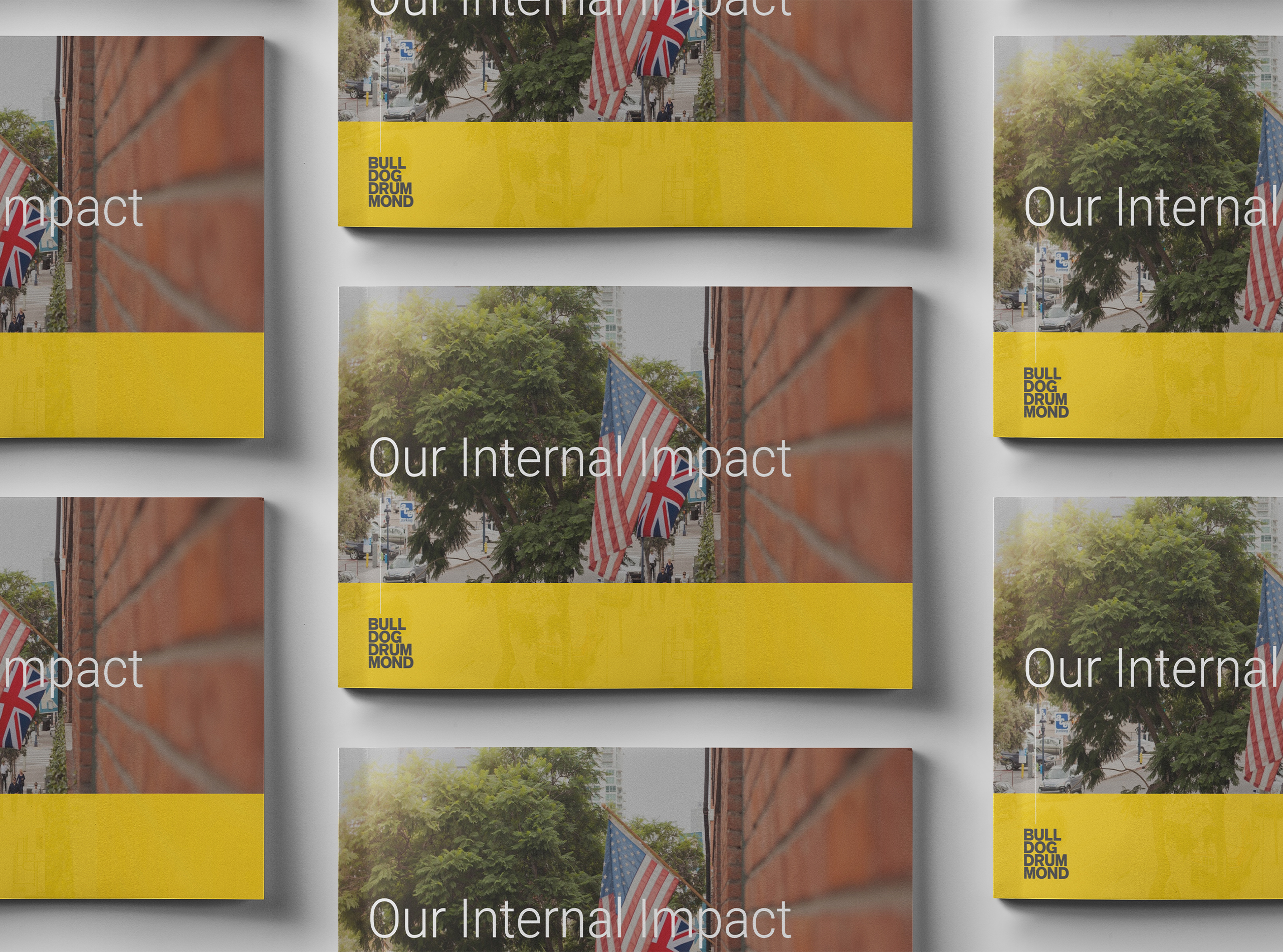
Our Internal Learning & Impact at Bulldog Drummond
The One Decision by Employers in 2021 that Means Everything
What I Wish I Knew

Standing Up Inside

Uncommon Person: Gregg Imamoto

Five Things Every Company Should Know about ESG

Redefining Value

Uncommon Person: Chris Baréz-Brown

It’s Time For A Whole Lotta Common Good

Did You Choose Humanity?

Uncommon Partnership: Violux

Here’s How

Uncommon Person: Santhosh Nair

Designing Strategy For A Complex World

Responsibility & Relevance for Brands