October 28, 2014
Bulldog Drummond
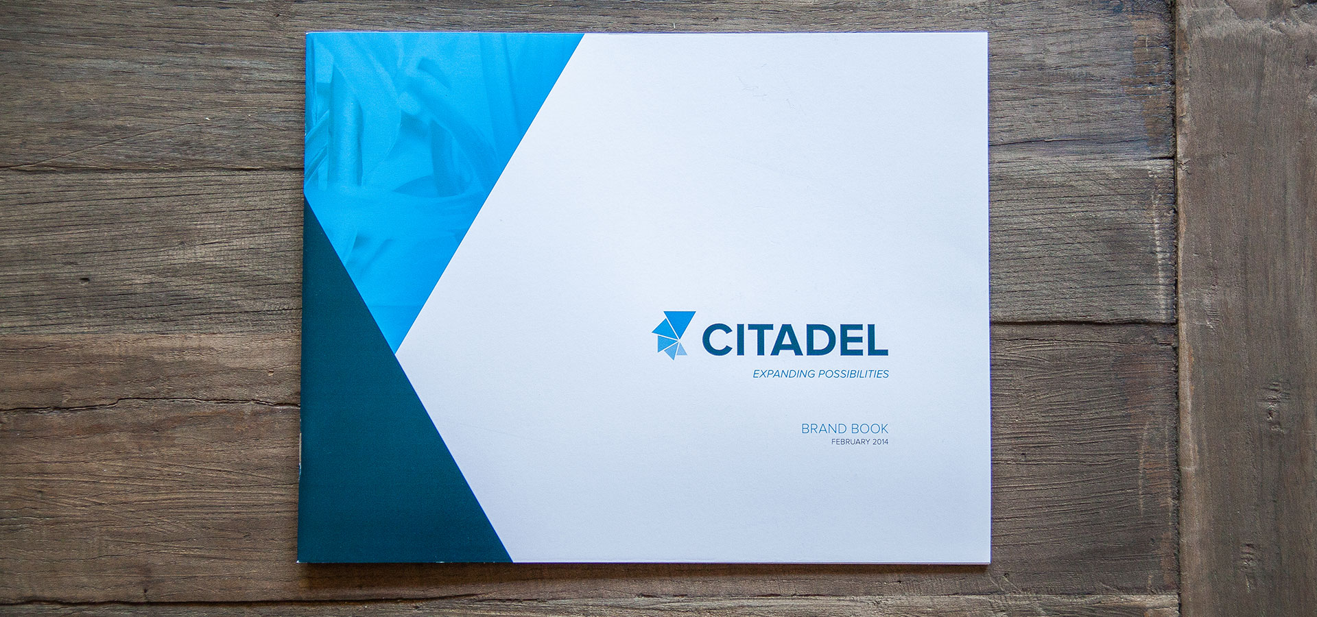
Bulldog Design: Citadel
Most people don’t think much about gearshifts or dishwashers or leaf blowers. In fact, most people probably don’t even think about what ties all these products together—plastic. But Citadel thinks about every distinct angle of plastics, from the processes, to the technologies, to the design and more. And as they continued to push the boundaries of this material and its technologies, they began to acquire leading companies in thermoplastics and engineered composites to offer a suite of options to help their customers make the best possible products in the world.
As the companies merged to become one unified brand, Citadel knew that they needed to create a unified face in the industry—one that clearly represents their expertise and their values. And that’s when they turned to Bulldog Drummond for help.
Bulldog worked closely with Citadel to develop a solid brand platform to ensure that all the companies were aligned in their internal actions, expectations and goals while helping their clients do what they do even better—whether that “better” means cost effective solutions, a new approach in materials and manufacturing, or developing custom compounds.
Bulldog’s next step was to redesign Citadel’s brand identity to be clean, contemporary and future-forward with a modern and clean sans-serif typeface, complementing their innovative approach to material design. Their brand mark is based on the triangle—the universal symbol for change, inspired by the simple notion that Citadel changes plastics into parts and products that are woven into every aspect of our everyday lives. The triangle is multiplied five times, exuding movement and growth while subtly mimicking the “C” in Citadel.


The result is a powerful and timeless identity that influenced the redesign of all their brand materials.
author —
categories —
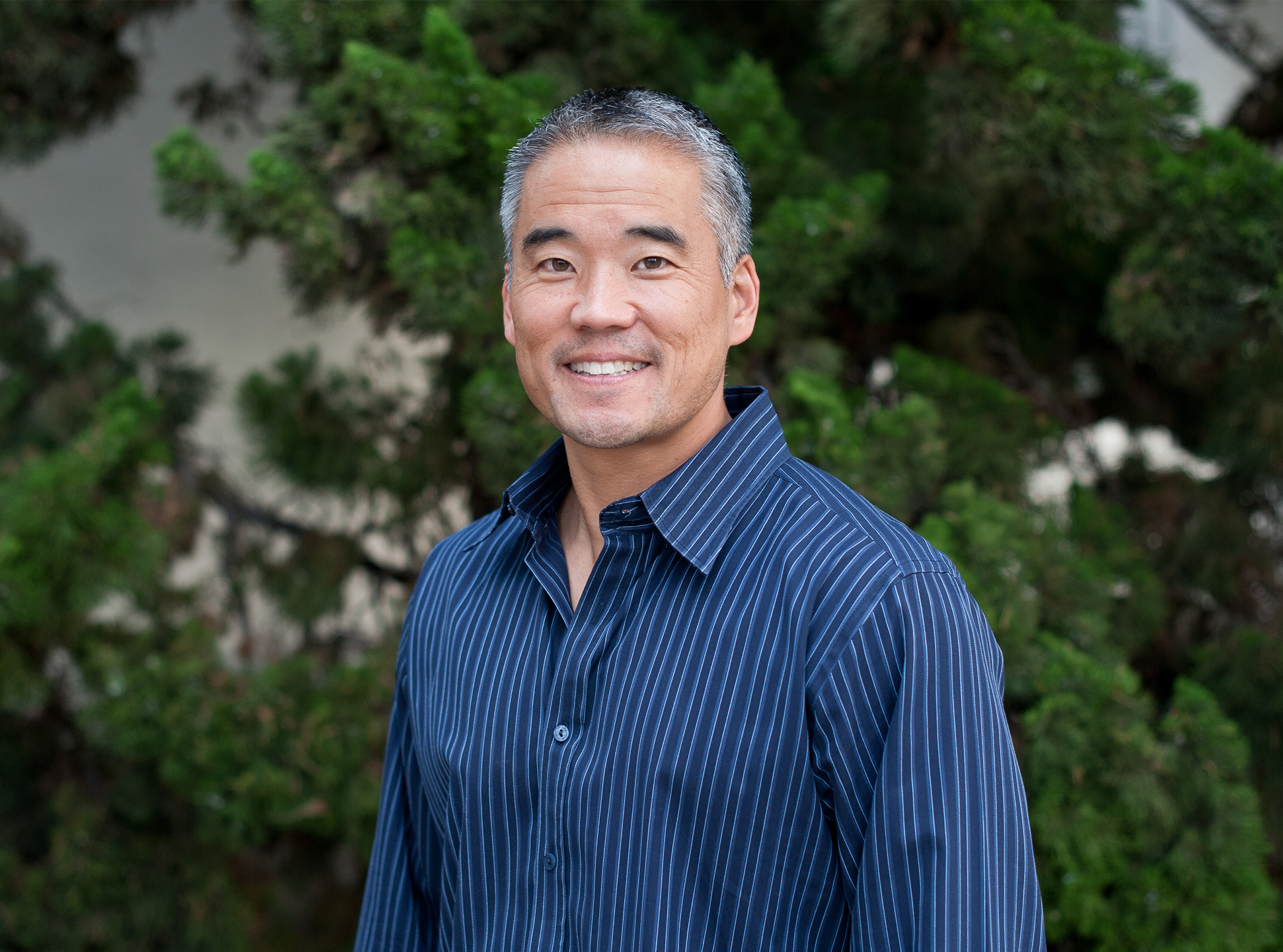
Uncommon Person: Chad Hutson
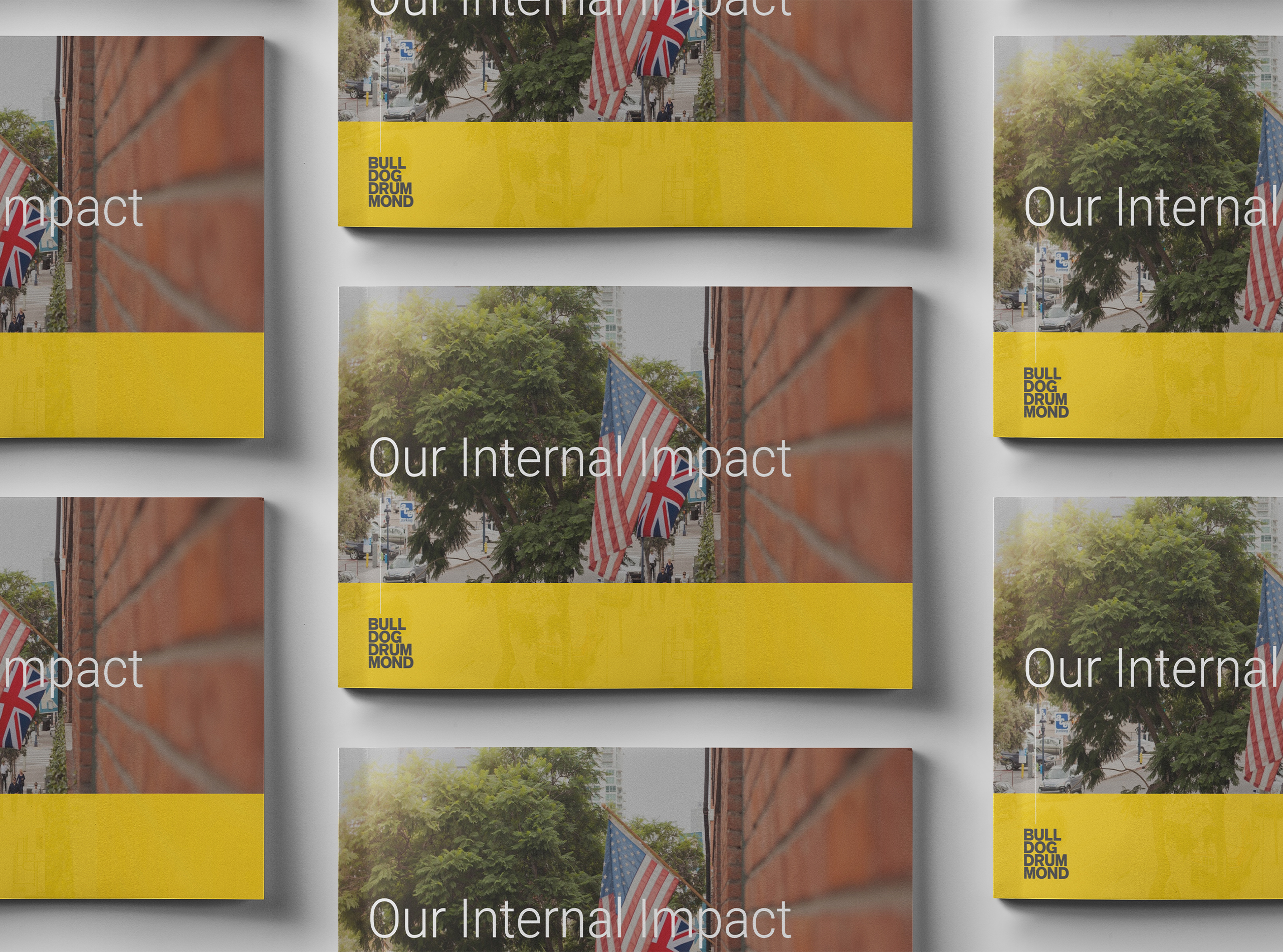
Our Internal Learning & Impact at Bulldog Drummond
The One Decision by Employers in 2021 that Means Everything

What I Wish I Knew

Standing Up Inside
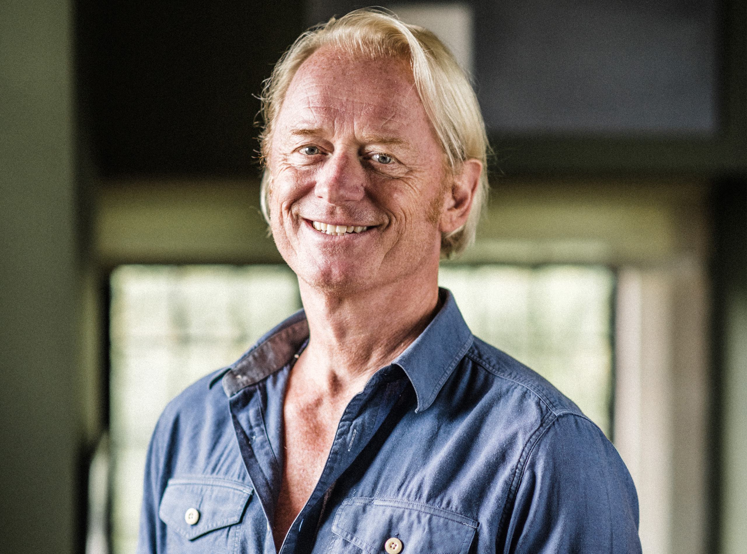
Uncommon Person: Gregg Imamoto

Five Things Every Company Should Know about ESG

Redefining Value
Uncommon Person: Chris Baréz-Brown

It’s Time For A Whole Lotta Common Good

Did You Choose Humanity?

Uncommon Partnership: Violux

Here’s How
Uncommon Person: Santhosh Nair

Designing Strategy For A Complex World

Responsibility & Relevance for Brands